
Brand kit
The SIP to Retire brand, ready to use.
Logos, icons, colours and the few rules that keep them looking right. Free to download for anyone writing about, linking to or working with SIP to Retire.
92 files: SVG, PNG and PDF logos, icons, social images and colour swatches.
Primary Reversed
- Name in text
- SIP to Retire
- Primary colour
- Dhara Teal #0F766E
- Typeface
- Inter, with Noto Sans
- Tagline
- Steady SIPs. A calm plan to retire.
Logo
One word, read as three
The wordmark is one word, SIPtoRetire, so it matches the domain. “SIP” and “Retire” are set in Inter 800; the small “to” is lighter and teal: the path between the two ideas. In running text, always write SIP to Retire with spaces.


Mark only


SVG and PDF are vector with outlined text, so they open anywhere without fonts. PNGs are transparent, 512, 1024 and 2048 px wide.
The mark
Three ideas, one path
- 1
Rising bars
Monthly instalments, each a little taller: wealth built step by step. Soft and rounded, never a sharp stock chart.
- 2
The drop
Your retirement corpus. The tallest bar flows into it: drop by drop it fills (बूँद-बूँद से सागर).
- 3
The saffron seed
The first rupee, and the one warm Indian accent in the mark.
Clear space
One bar width
9/48 of the mark’s height, on every side. Nothing else enters it.
Minimum size
16 px mark96 px logoColour
Trust, depth and one warm accent
Dhara Teal sits between the green of growth and the blue of trust, and echoes the drop. Deep Navy adds weight; saffron is used sparingly. The palette avoids reds and pinks: red means a loss. Click any value to copy it.
60%Paper and neutrals
30%Teal and navy
10%
Primary
Dhara Teal
The brand colour. Buttons, links, the mark.
Deep Navy
Institutional depth. Headings and data.
Saffron
The one warm accent. Highlights and the seed; fills only, never text.
Neutrals
Ink
Text and the wordmark on light backgrounds.
Slate
Body copy and secondary text.
Mist
Borders, dividers, gridlines.
Paper
Backgrounds. Most of every screen.
Supporting
Drop Teal
The drop in the mark.
Light Teal
Teal on dark backgrounds: bars, buttons, links.
Mint
The drop and "to" on dark backgrounds.
Saffron Text
Saffron when it must be text (4.8:1 on Paper).
Night
Dark backgrounds and dark mode.
Data
Gain
Gains, always with ▲ and a + sign.
Loss
Losses, always with ▼ and a − sign.
Every text pairing passes WCAG AA
| Pairing | Sample | Contrast | Use it for |
|---|---|---|---|
| Teal on Paper | Aa | 5.2 : 1 | Links, labels, eyebrows |
| Paper on Teal | Aa | 5.5 : 1 | Buttons, banners |
| Navy on Paper | Aa | 9.9 : 1 | Headings, data |
| Ink on Saffron | Aa | 8.3 : 1 | Highlight chips |
| Saffron Text on Paper | Aa | 4.8 : 1 | Saffron as text |
| Slate on Paper | Aa | 7.2 : 1 | Body copy |
| Saffron on Paper | Aa | 2.1 : 1 | Never for text; fills only |
Typography
Inter for clarity, Noto for every Indian script
Aa
Inter
Headings 800, body 400–600. Tabular figures, so ₹ columns line up.
Regular 400Medium 500Semibold 600Bold 700Extrabold 800
₹11,20,179 · 12.4% · ₹2.85 crore
Inter on Google Fonts →अ
Noto Sans Devanagari
Hindi and Marathi. Line height 1.6 for Indic scripts.
बूँद-बूँद से सागर
“Drop by drop, an ocean.”
ગુજરાતીবাংলাதமிழ்తెలుగుಕನ್ನಡ
Noto Sans on Google Fonts →
96Calm
64Steady SIPs
44A calm plan to retire
32How far can a steady SIP take you?
24Every projection names its assumed return.
16Body text never goes below 16 px on screen. Short sentences, no jargon without a tooltip.
Icons and social
When there is no room for the name
The mark is the short form. App icons put it in Paper on a teal tile with a soft top light, never with the wordmark. Avatars use the reversed mark on navy with a teal ring, so any circle crop keeps the whole mark.


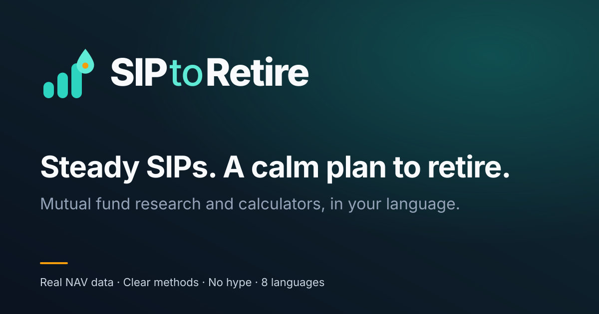
Social and email



Usage
Keep it calm, clear and in proportion
Do
Don’t
The name in text
Always SIP to Retire, with spaces, in Latin script in every language. SIPtoRetire, SIP2Retire and translations are for nowhere but the logo, and the logo is only ever one word.
Gains and losses
Always with an arrow and a sign, never colour alone: ▲ +12.4% ▼ −3.1%
Charts
Series in a fixed order: teal, navy, saffron, violet, slate. The fund is a solid teal line; its benchmark is dashed navy. Every chart states its date and source.
Voice
A friend who knows mutual funds
Tagline
Steady SIPs. A calm plan to retire.
बूँद-बूँद से सागर
“Drop by drop, an ocean”: a SIP, and the drop in the mark, in four words. It promises a plan, never an outcome.
Calm
No hype, no urgency. Retirement is decades away; there is time to think.
Honest
Every projection shows its assumptions, source and date.
Plain-spoken
Short sentences, second person, no jargon without a tooltip.
Local
Eight Indian languages, lakh and crore, Indian proverbs.
We say
- Assumed 12% a year
- Returns can vary
- A calmer retirement plan
- Mutual fund distributor
We never say
- Retire rich
- Guaranteed pension
- Best fund
- Assured returns
- Advisor
Need another format or have a question?
Write to us and we will get back to you. Press, partners and creators welcome.